In this website I'll be showing you some techniques for DIGITAL art, keep in mind that I started digital art approximately 7 months ago and I'm still improving. also understand that this will have biased opinions, so just because you use some of these techniques doesn't mean that your art is bad, because it isn't! no art style is bad, so if you don't love yours, then learn to love it!
If you are a long term artist, then you probaly know about the importance of posing. the position that your character is on usually shows their emotion and personality. If you are new to art, then now you know. facial expressions are just as important. When you start with your character, a tip is to pick a position that will not only show two of their sides (3/4 way view) but will also show off who your character is.
plain lineart isn't very pleasing to the eye, so we usually add colours, shading, and in most cases both! we all know that neon colours on a character will not only be blinding, but will give off the hint that your chararacter may be a mary/gary-sue (that's not always true, but it seems like a lot of people think that way). If you do feel like adding neon colours to your character, then maybe a small pattern of colour might help. now that we have neon out of the way, let's continue into using blacks. Of course, black is a very important colour when it comes to art, but using too much of it might damage the image. I started seeing a bunch of characters with black eyes a while ago, and I wouldn't mind it if the character wasn't wearing all black clothing. I'm not saying that there is anything wrong with that (heck, even I do it), but using different shades of grey might help with the cause, just a hunch though. now shading, there are many ways to shade a drawing, like shading with a darker shade of the colours that you are using is a very popular choice. another interesting shading technique is to use one solid colour and then lowering the opacity of the layer that you were shading on. now that we are done with two common good shading techniques, im going to tell you one that I don't recommend using. shading with black, the results aren't always pretty and using the airbrush tool for it looks messy. I'm not saying "don't shade with black" because good results are always a posibility but if you want the best results I'd use a different technique.
Now, I going to say that it is still a struggle for me to do backgrounds, but I am going to tell you what I know about them. If you're feeling like doing an extremely detailed one, then there are two things I can help you with. for starters, you can make your background first, it'll help in the way that you don't have to mold a background to the character's form or colour. another tip for backgrounds, is to use warm or cold colours depending on the location, this tip actually works for any kind of background.now, simple backgrounds are what they are... simple. they usually consist of gradients or one colour, so how do you make it pleasing to the eye? use a colour similar to the colours of your characters colour palette. If your character's palette consists of lilac, I'd usually go for a lighter or darker shade of it so that it doesn't contrast, but you can go wild with your colours.
you don't have to pay attention to this because I'm not a profecional, and I won't be one in a while considering that I started digital art 7 months ago (this was a school thing). if you want to be sure about anything that I told you, you can go make more research to find the information that you need. another thing that i recommend is to not care as to what people tell you about your style. if "the head is to big" or "the body is too thin", you shouldn't care. it's your style and you can keep on improving on anatomy as you go. you'll be surprised as to what you can make out of your art
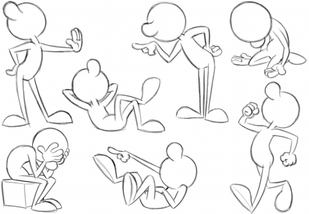 example of expresive posing
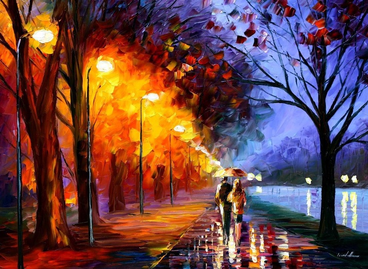 example of warm and cold colours